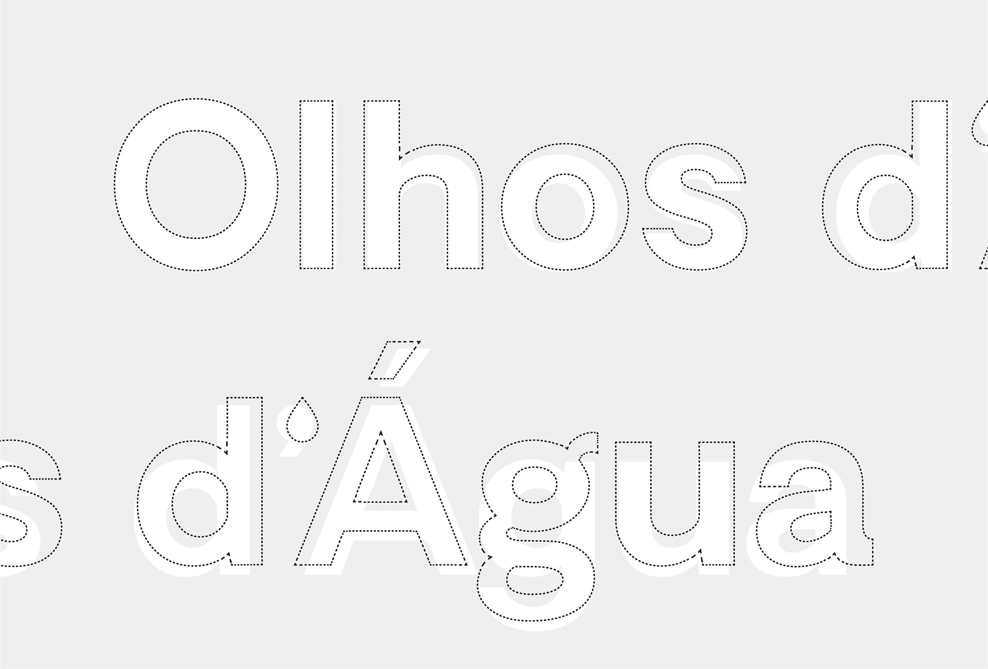
Olhos d'Água
Branding, Environmental Graphics & Digital Design
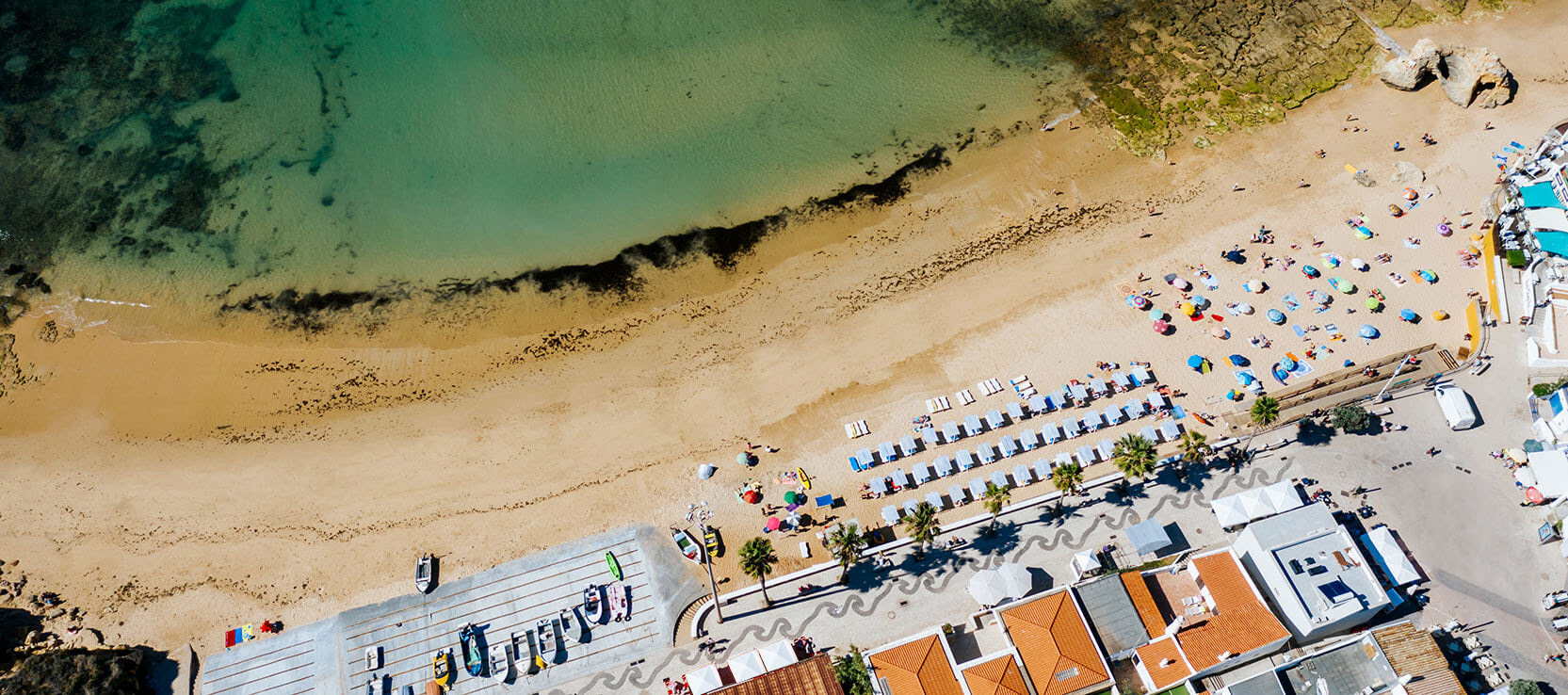
Olhos d'Água is a delightful Portuguese fishing town situated in the heart of the beautiful Algarve. This peaceful town is centered around a sandy cove, where fishing boats are moored on the golden sands and old fishermen tend their nets in huts that line the shore.
The Challenge
Catching the wave (of tourism)
In the latest decades, the “boom” of tourism in Portugal generated a massive development in the Algarve region with giant private investment in hotels and resorts taking advantage of the weather and the best shoreline locations. This attracted nearly 5 million people per year just to the region of Algarve. With that in mind, Olhos d’Água (located in Albufeira, known as the “Capital of Tourism”) implemented a strategy to manage and market the tourism in the village. In order to achieve that, the parish council needed a brand identity and a design system to communicate effectively.
The Strategy
Swimming with the big fish
Just like a lot of coastal villages and cities in the Algarve (and Portugal), the main economic factor was fishing. The big difference with Olhos d'Água is that even to this day, hundreds of families benefit from that life. In this village fishing is still a big factor despite the constate growth in revenue from tourism.
The celebration of that became our strategy. Show to the world that Olhos d'Água is a welcoming place to the foreigners seeking a bit of sun and sea, but also very proud of it's culture and the men that face the sea daily.

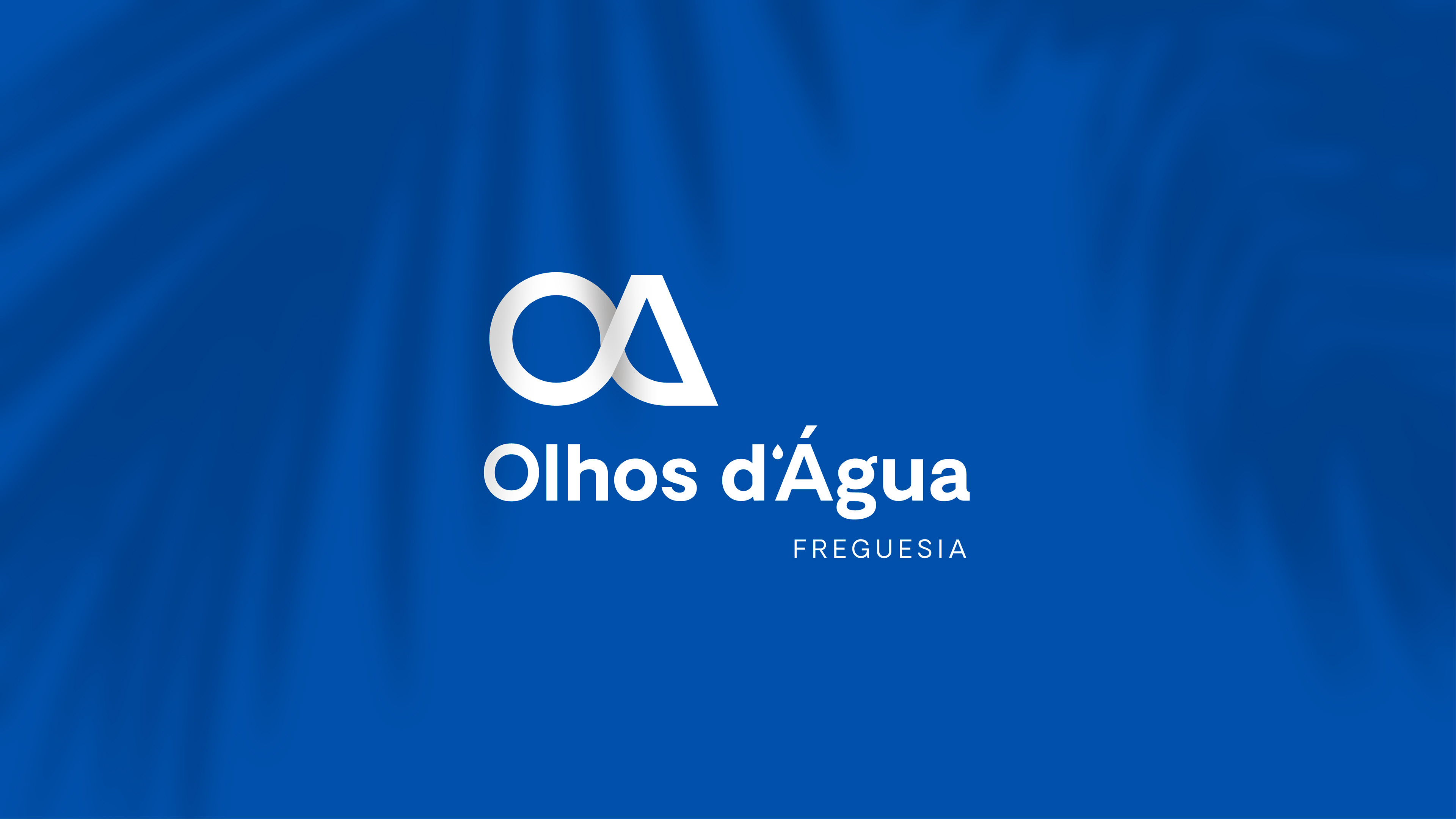
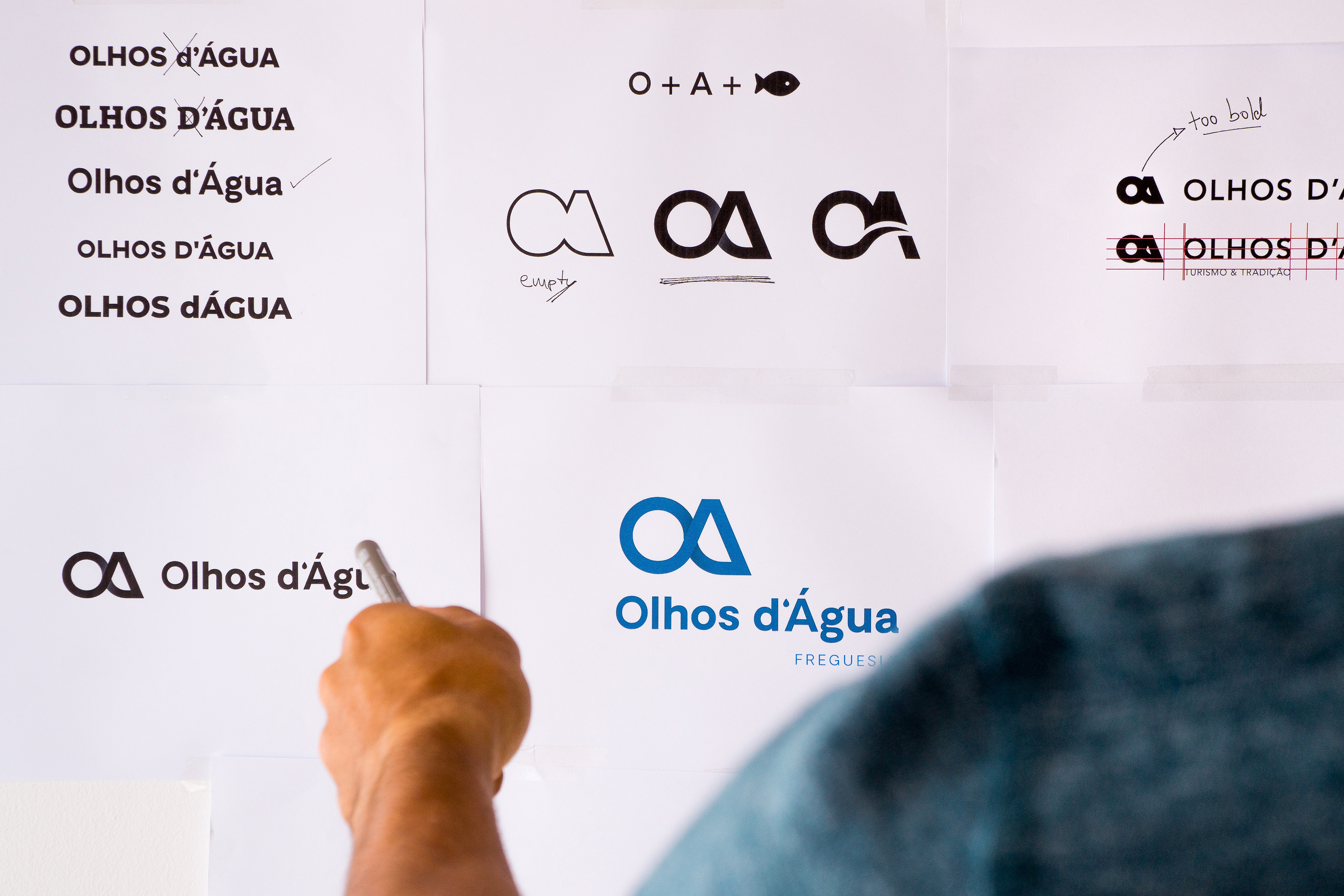
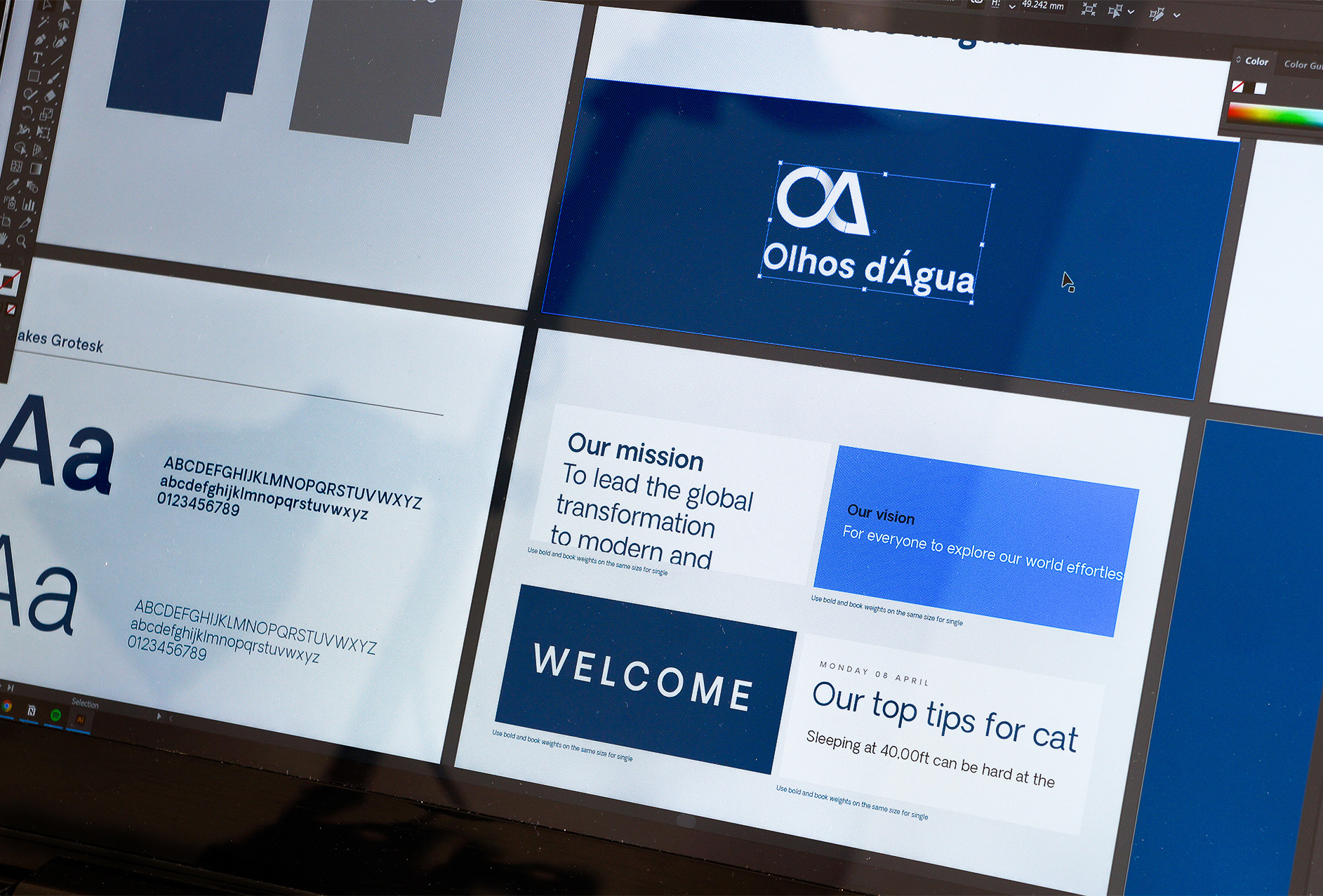
Monogram of O and A resembling a fish
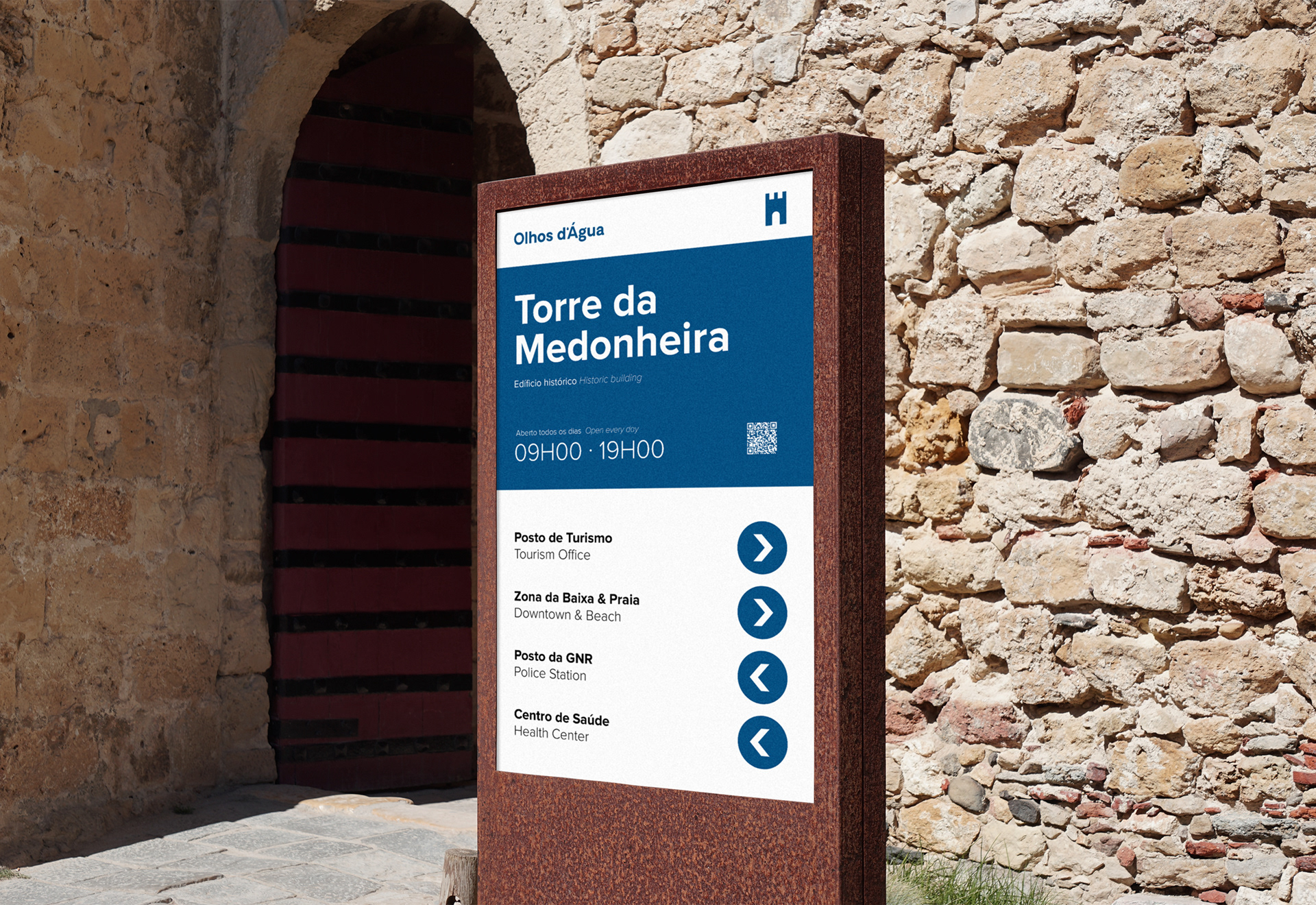
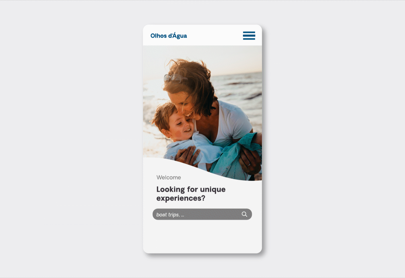
The Branding
Keep it Simple
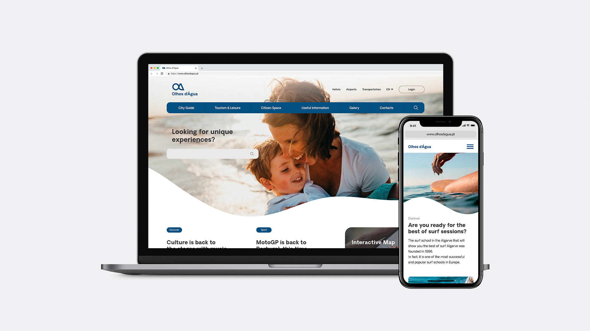
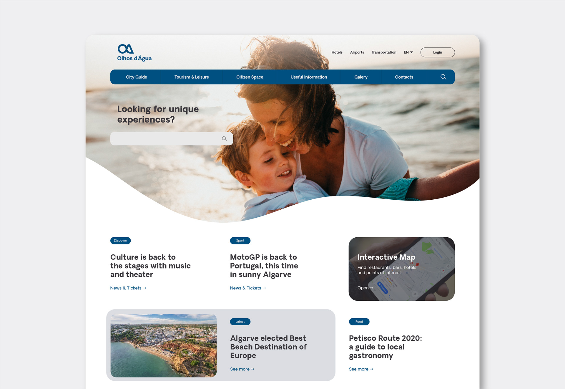
The brand narrative, verbally and visually, is built on user-friendliness, easy access, and freshness. A clean typography to guide the users, and a strong blue color helps to create hierarchy on the communication.
The textures of shades helps to evoque the freshness of a shade, and the wavy lines as a mask is a tribute to the amazing views to the ocean this village has.