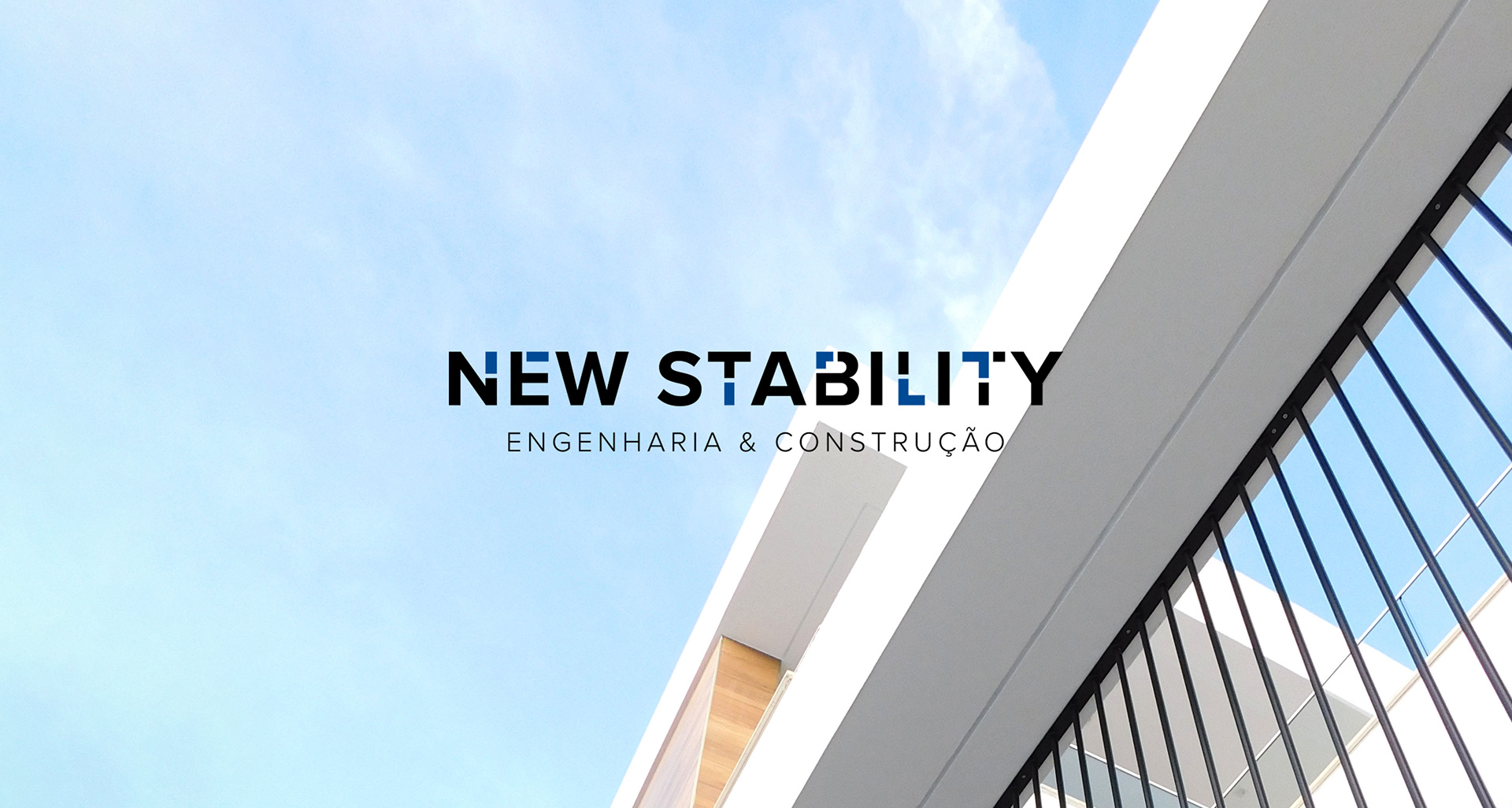
New Stability
Strategy, Brand Identity & Web Design ↗
A young yet experienced team of civil engineers gathered to bring fresh ideas to the market.
Granting a large range of services, the main focus is to become a partner more than a service provider through the policy "quality over quantity".
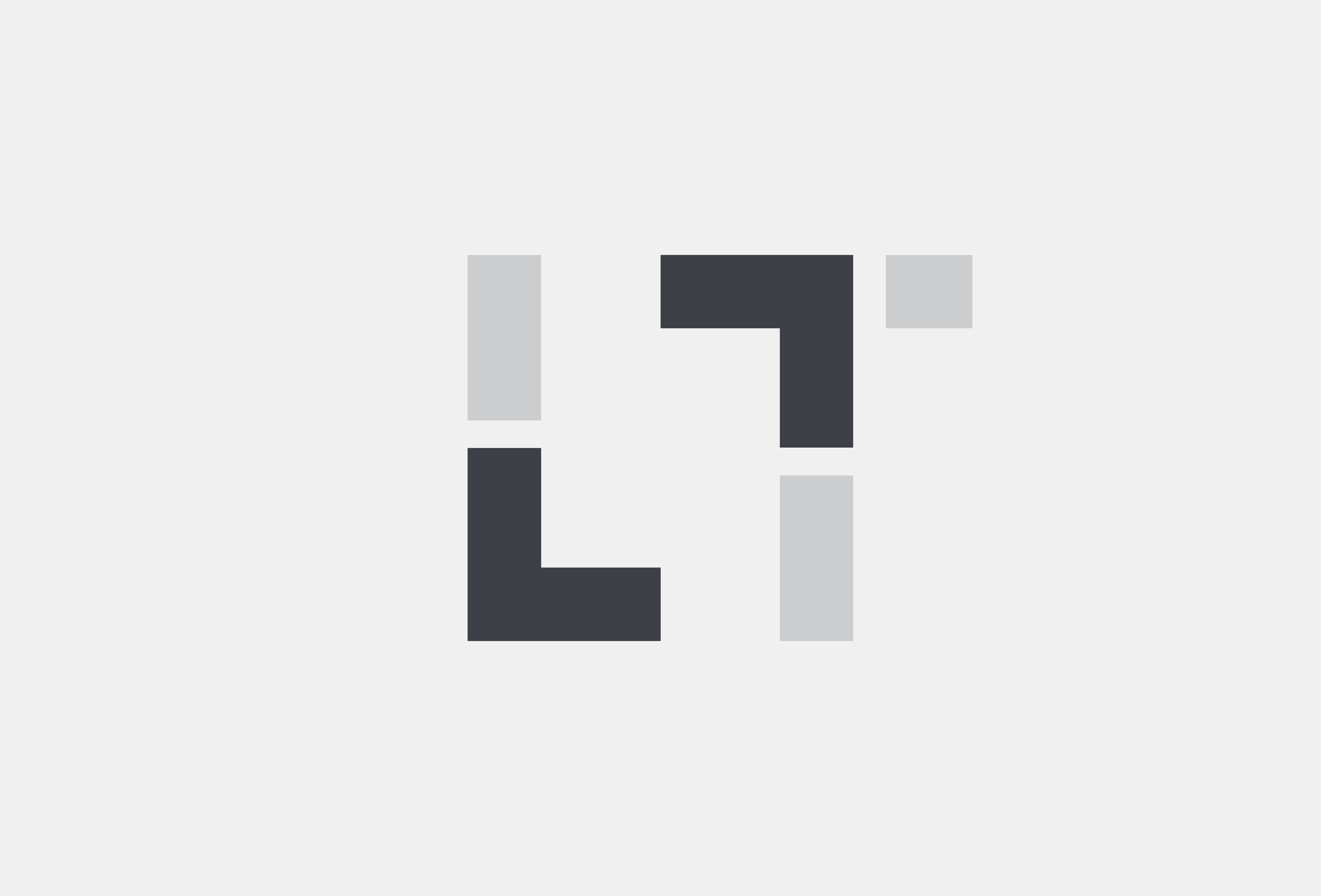
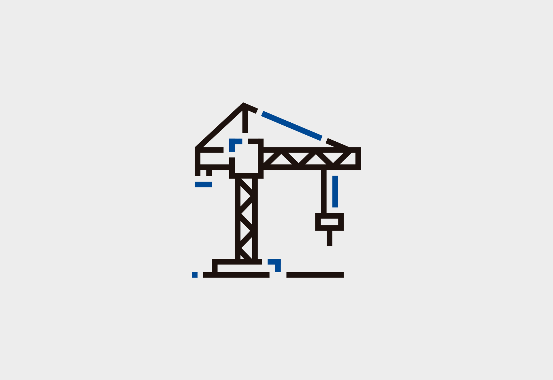
The sharp 90 degree corners represent the accuracy and precision by their work.
A brand with solid foundations.
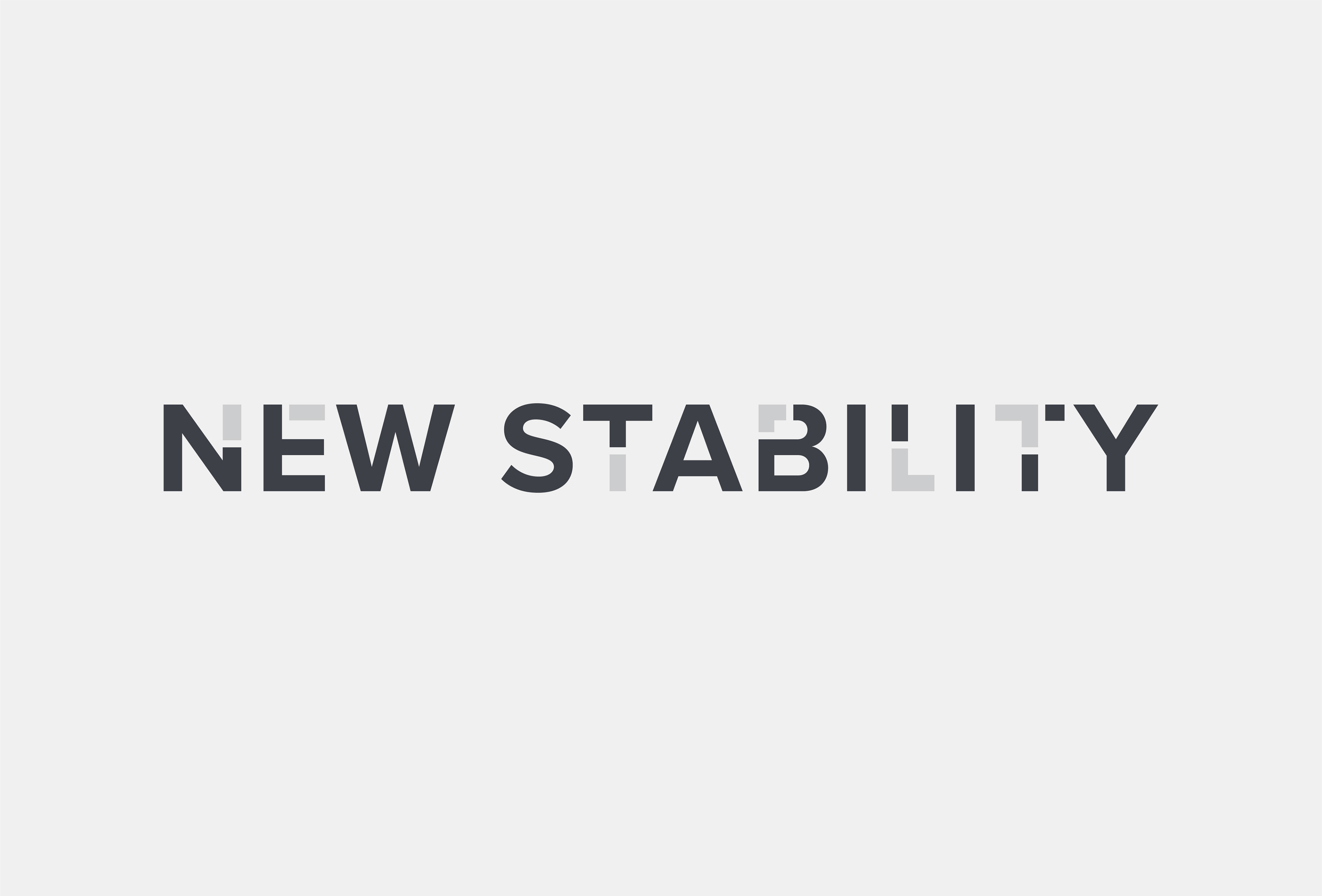
The blocks that form the letters were the conceptual starting point. They intend to represent the work that the company does (construction and renewal). The sans-serif font with strait angles shows the modern and precise approach of the building process. Also, the usage of blue represents the confidence and trust the clients get from New Stability.
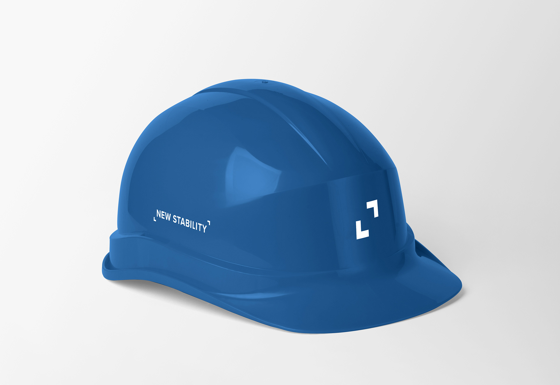
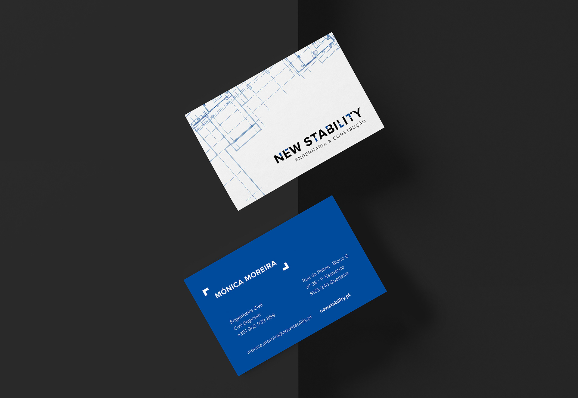
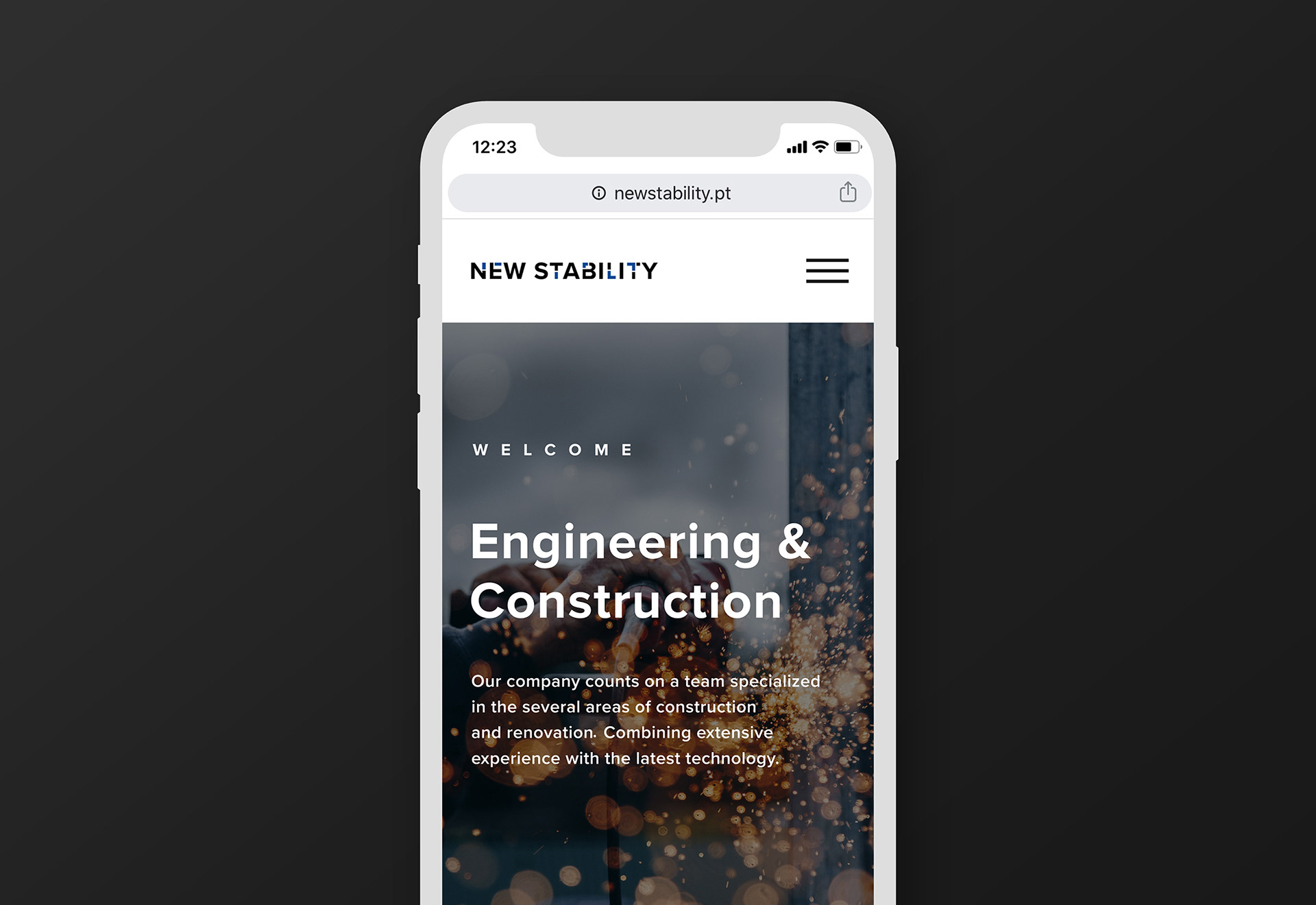
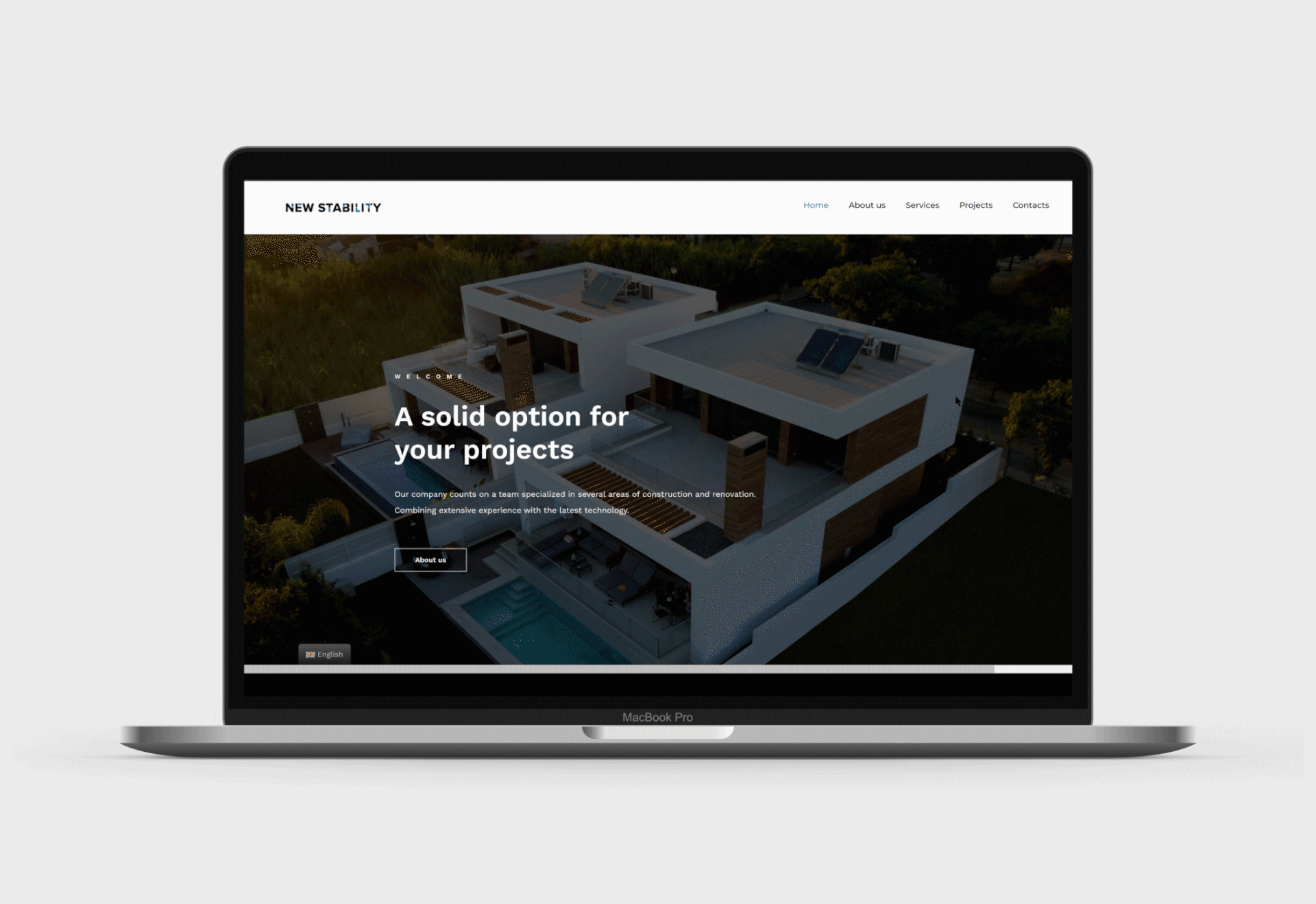
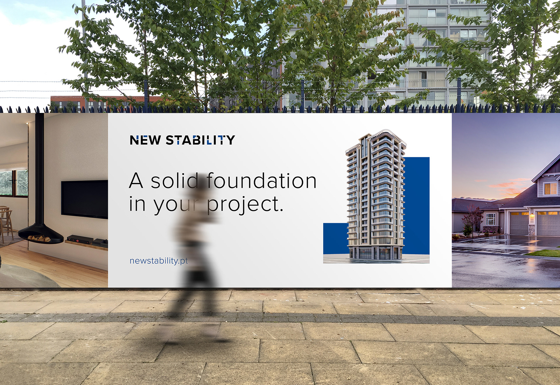
The second step of the brand was the activation, applied on trucks, uniforms, constructions sites, etc. That create the need of designing a responsive logo, as shown below.