Armação de Pêra
Strategy, Branding & Environmental Graphics ↗
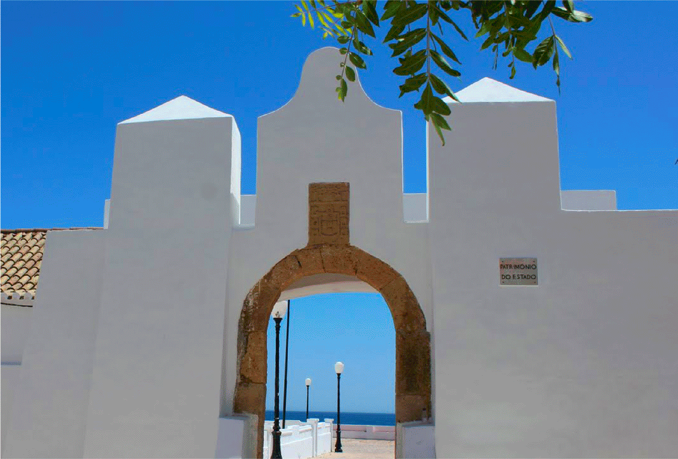
Armação de Pêra was, for a long time, a fishing village attracted by the abundance of fish. A large fishing net (Armação) was built to capture tuna in the sea. The original place was already called Pêra.

The Challenge
No system in place
The parish council of Armação de Pêra didn't have any system in place to communicate with the village. Although they had a coat of arms, they didn't have the tools to share a cohesive communication to the general public. Their digital and printed presence didn't obey to any rules and was constantly changing, making it a source hard to identify.


The Strategy
Honor the past, embrace the present
Being a village that lives almost exclusively from tourism, it was important to create an image that would make everyone proud of it, not only the tourists, but also the people that live here all year round. In order to do that we focused on identifying the aspects that make locals proud and still celebrate to this day.
This took us to a deep dive into learning the history and culture of this place, the strategic placement and his role in the defence of the Portuguese coast in the medieval ages. The fishing culture that was the main mean of subsistence until tourism became the biggest economic factor in the region.


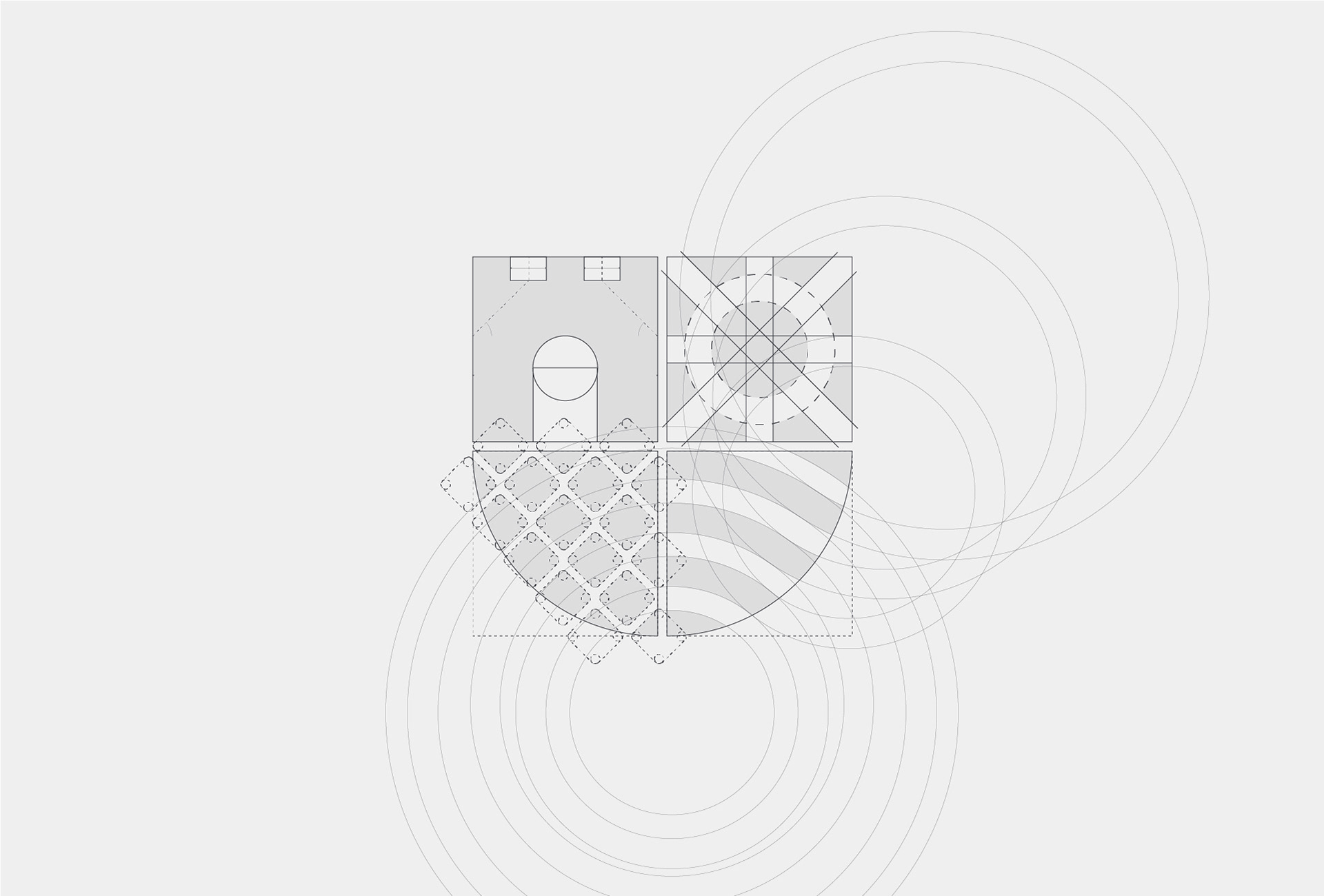
The Branding
A solid system and a subtle presence
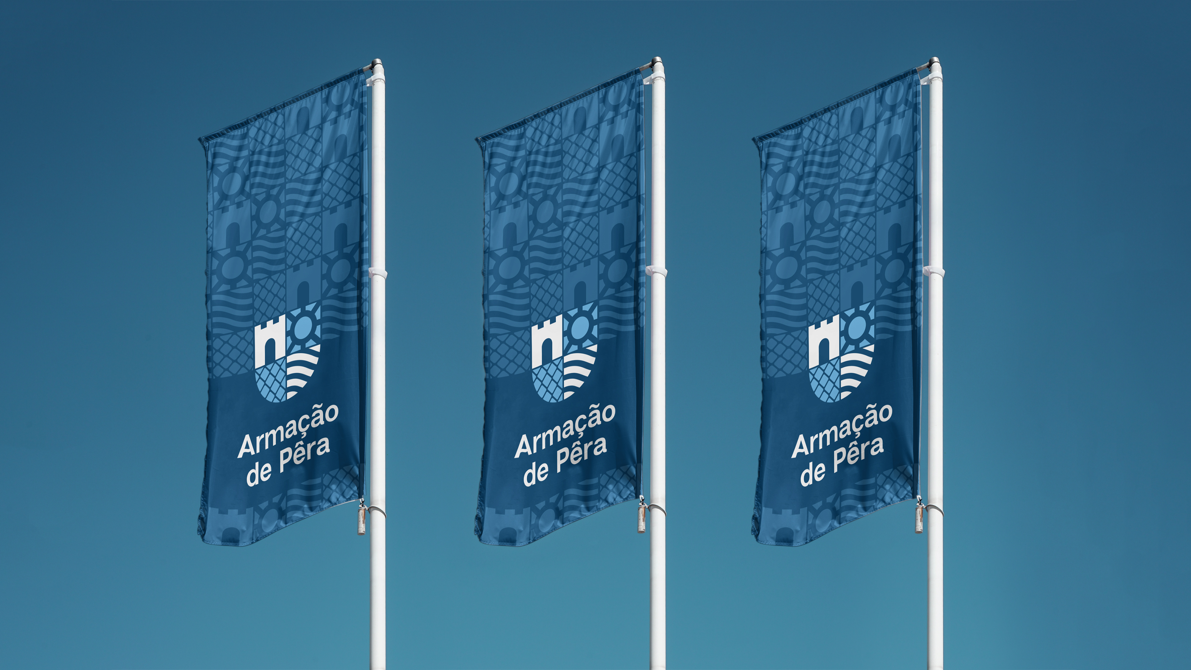
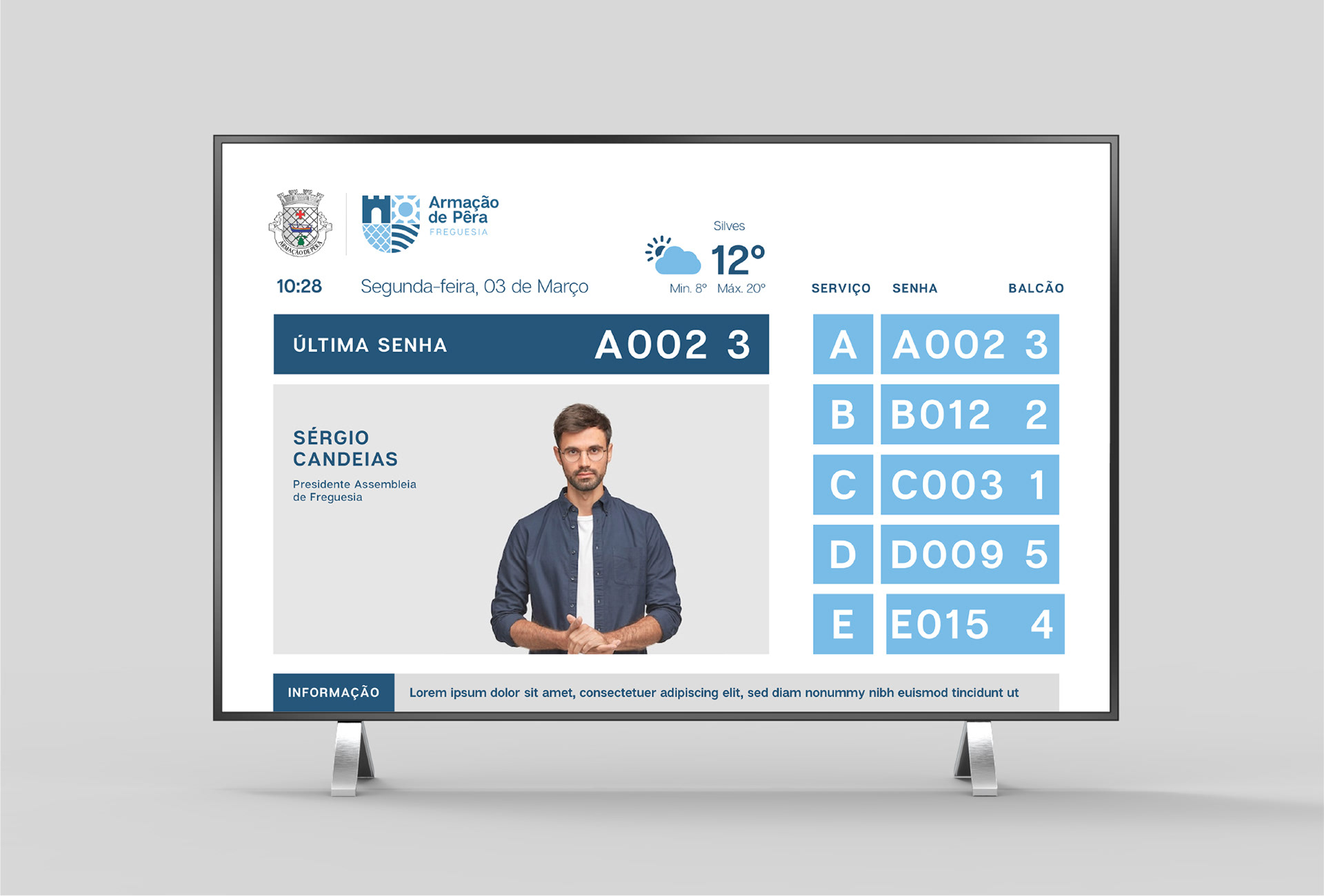
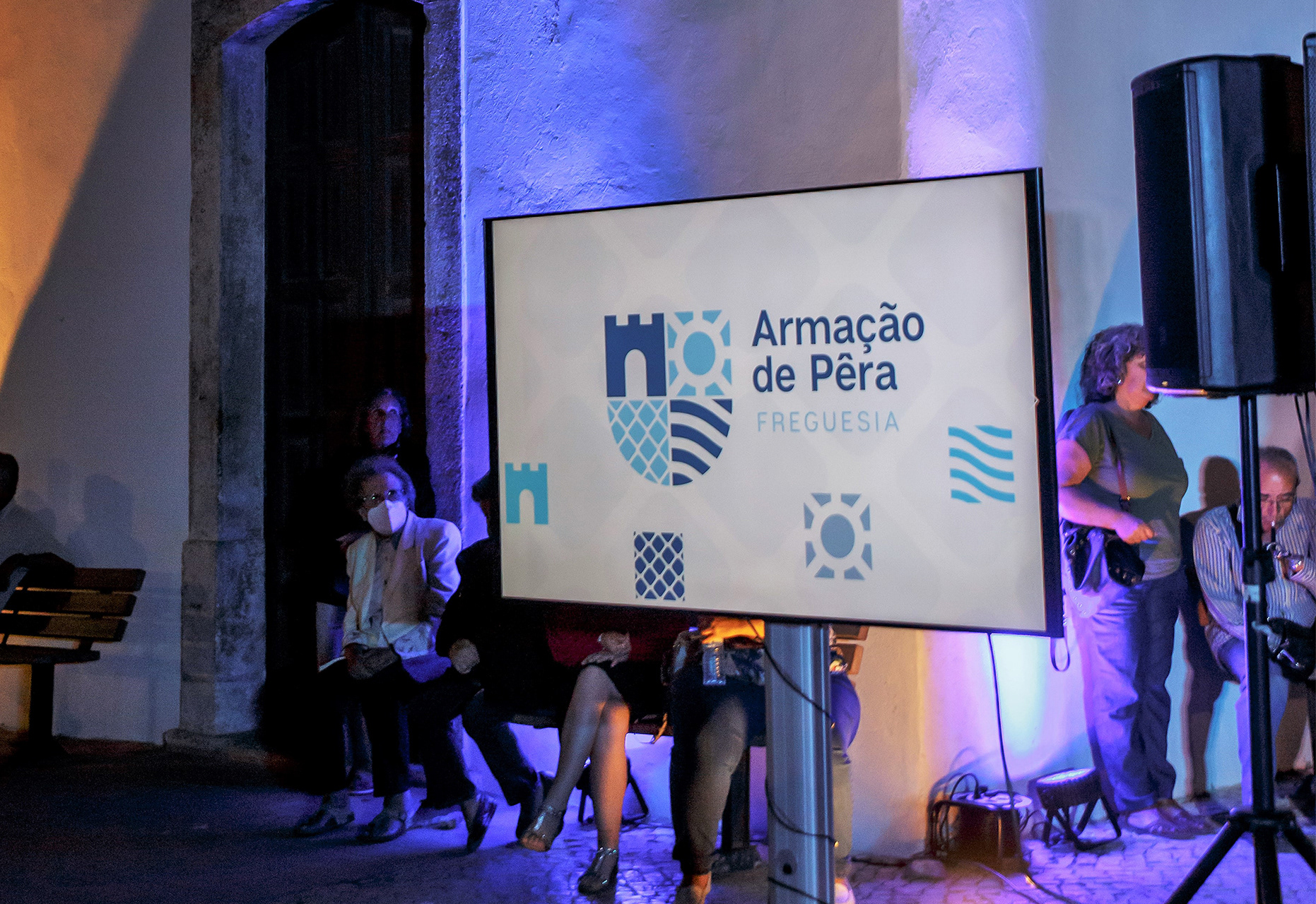
Visually we now have a striking image that's easy to identify but still subtle to the eye. A strong symbol that embraces the history and the culture of the village, a clean typography to support it, and a nice contrast of blues to blend it in the amazing blue skies of the Algarve.
The pattern and the icon system helps to solidify the identification of the parish council without the constant repetition of the logo. The typographic work using Articulat CF makes the communication organised and easy to read.


The Launch
Proud results
Visually we now have a striking image that's easy to identify but still subtle to the eye. A strong symbol that embraces the history and the culture of the village, a clean typography to support it, and a nice contrast of blues to blend it in the amazing blue skies of the Algarve.
The pattern and the icon system helps to solidify the identification of the parish council without the constant repetition of the logo. The typographic work using Articulat CF makes the communication organised and easy to read.
Made at Kapta.